Identity Guidelines
Logos
Our logo is the most visible and valuable asset of our brand identity. It’s a mark that unites our programs. The elements that make up our logo are a direct reflection and representation of the brand.
Primary Logos
Guttman Holdings has three official logo lockups as seen below—Guttman Holdings grouped with the three subordinate companies (Guttman Energy, Source One Transportation, and Guttman Renewables), Guttman Holdings with the descriptor “An Employee-Owned Company”, and Guttman Holdings stand-alone.
Secondary Logos
While the full color primary logos are preferred, there are instances where a single color (secondary) logo is necessary. Designers should carefully choose which logo is most appropriate in the context of their design.
Logo Colors
When presented in color, the Guttman Holdings logo lockup is represented with the five colors that make up the three subordinate company logos.
| Pantone | CMYK | RGB | HEX | |
|---|---|---|---|---|
| 647 C | 91, 63, 20, 4 | 35, 96, 146 | #236094 | |
| 16, 100, 76, 5 | 196, 13, 60 | #C40D3C | ||
| 5483 | 73, 34, 39, 5 | 75, 133, 142 | #4b858e | |
| Blue 072 | 100, 79, 0, 0 | 0, 79, 163 | #004fa2 | |
| 369 | 57, 0, 100, 0 | 122, 193, 66 | #7ac142 |
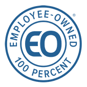
Descriptor Tag
For external communications only, the descriptor tag below can be appended to any of the three subordinate company logos. The descriptor tag is subordinate to the company logo. Each company has its own lockup as well as a vertical and horizontal version. If necessary, each lockup may become a white knockout.
Guttman Energy
Horizontal
Vertical
Source One
Horizontal
Vertical
Guttman Renewables
Horizontal
Vertical
In places where the descriptor tag is inappropriate or unnecessary, designers and writers may use the following language as small print.
“‘Company name’ is a subsidiary of Guttman Holdings, an employee-owned Company.”
Logo Misuse
Below are some examples of wrong usage of the logo. In order to maintain a cohesive look across all channels, please refrain from committing any of the following mistakes.
1. Do not alter text.
2. Do not change company logo colors.
3. Do not condense or inappropriately scale the logo.
4. Do not place the logo on a complicated background or a background that provides insufficient contrast.
Clear Space
To ensure legibility, always keep a minimum clear space around the logo. The space isolates the mark from any competing graphic elements like other logos or copy that might conflict with, overcrowd, or lessen the impact of the logo.
The minimum clear space is defined as the letter ‘G’ in the Guttman Holdings logo.
Minimum Size
To ensure visibility, logos should never be presented in sizes smaller than the requirements shown on this page. Logos should be sized appropriately for the piece being designed.
420px
If logo needs to be larger than the size provided, use one of the logos below.
245px
220px
122px
Color Palette
The color palette for Guttman Holdings is the same two colors as the logo.
| Pantone | CMYK | RGB | HEX | |
|---|---|---|---|---|
| 647 C | 91, 63, 20, 4 | 35, 96, 146 | #236094 | |
| 0, 0, 0, 50 | 147, 149, 152 | #939598 |
Design Elements
To view typography, photos, and iconography guidelines please click here. The design elements are universal to all Guttman Holdings Companies.